History of Fonts
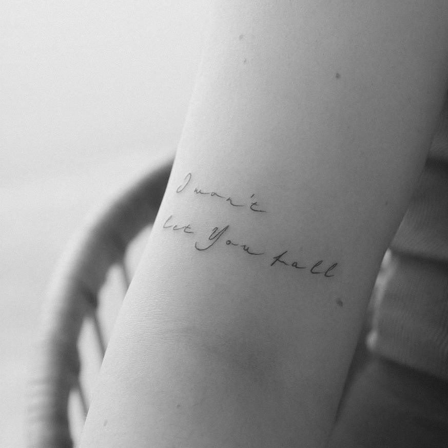
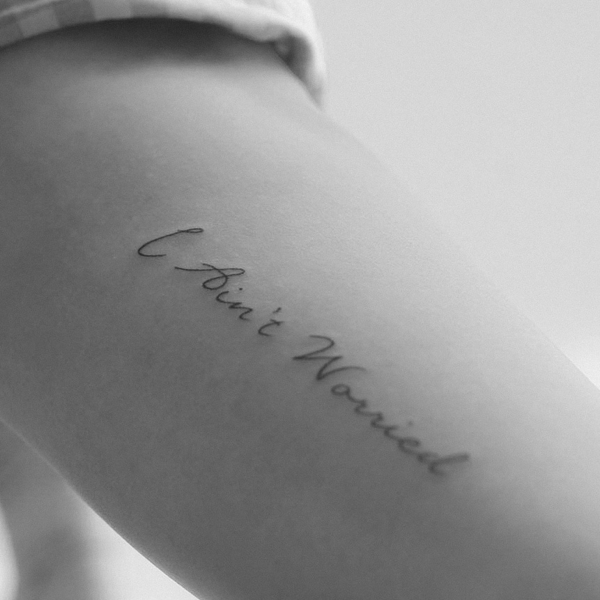
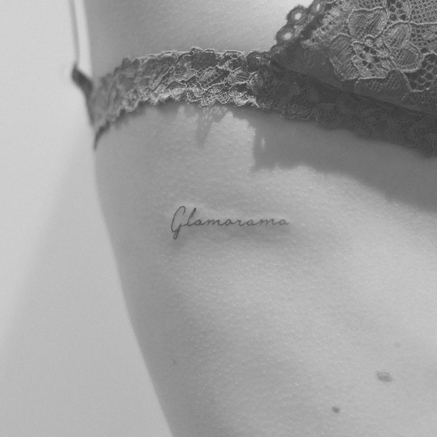
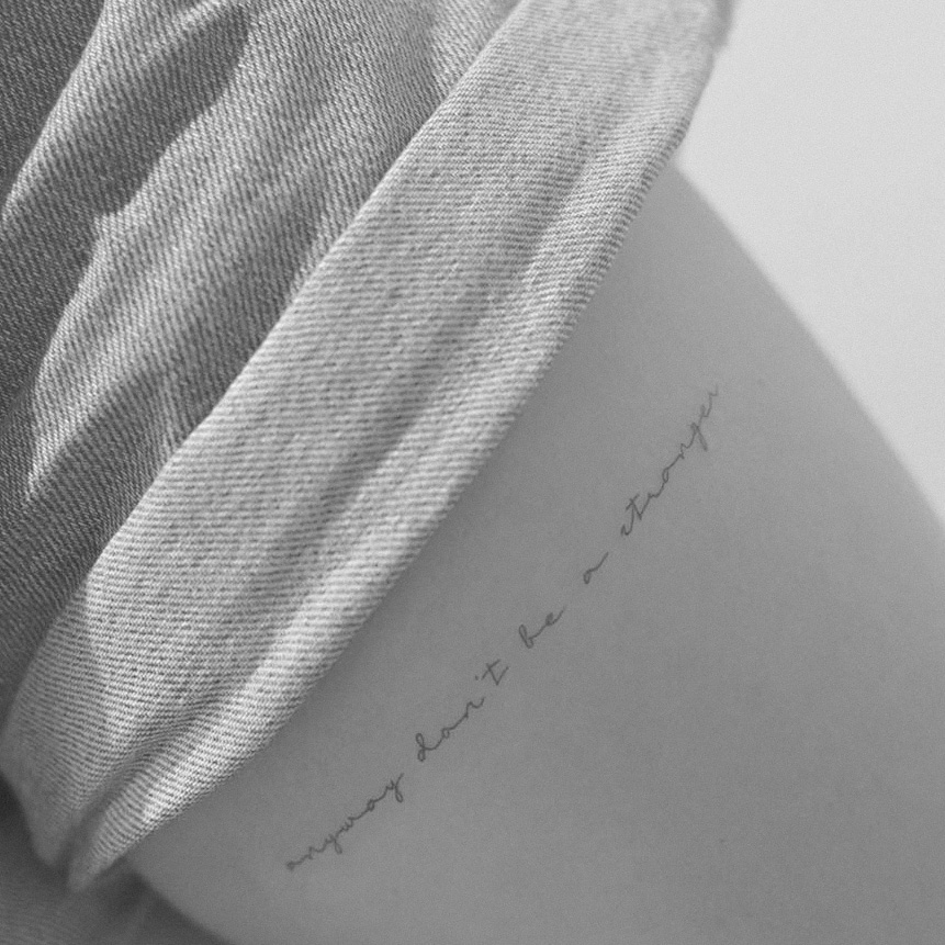
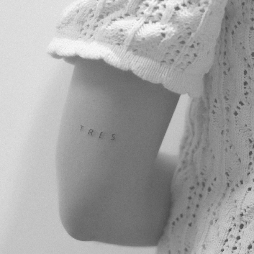
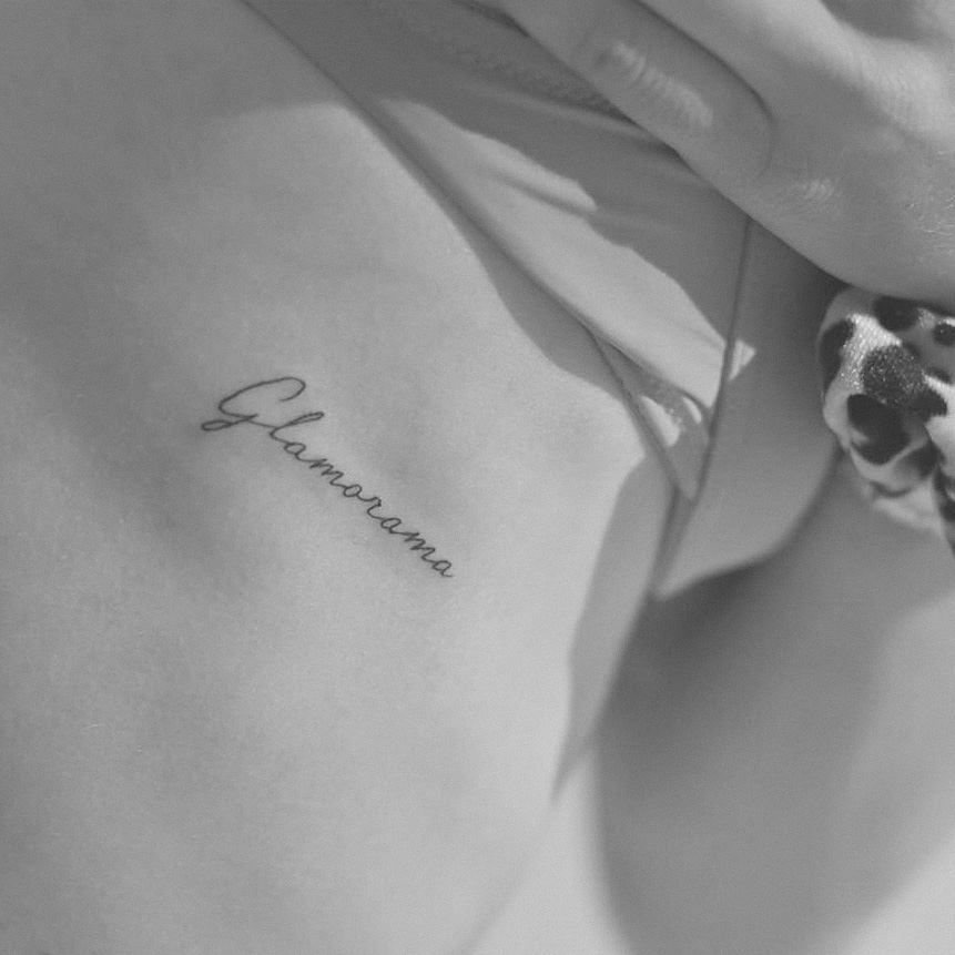
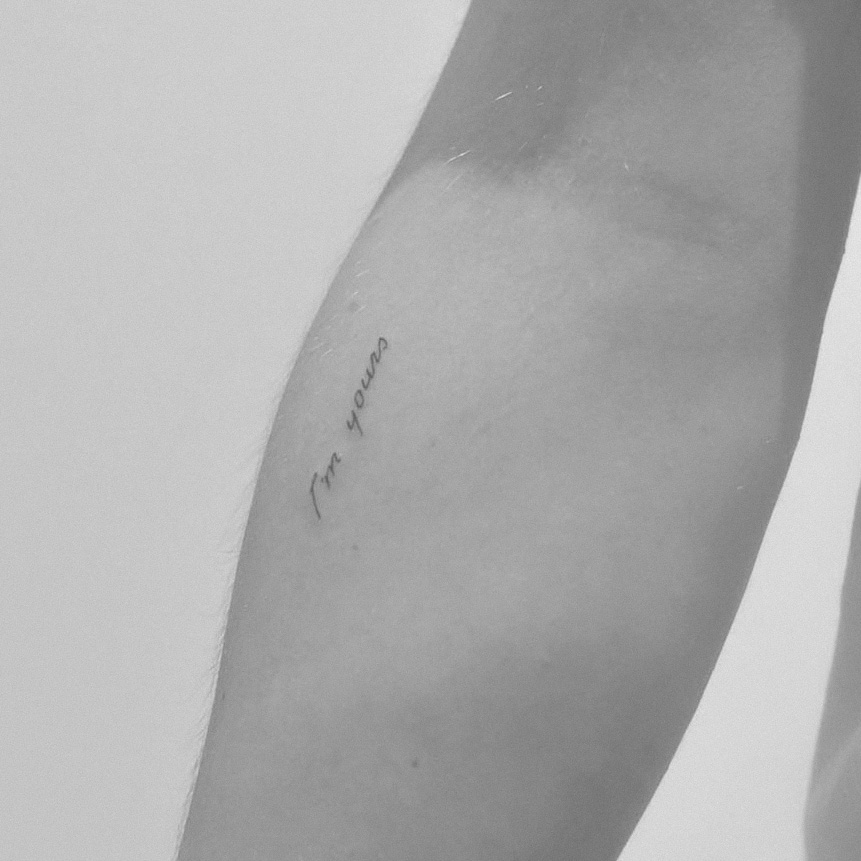
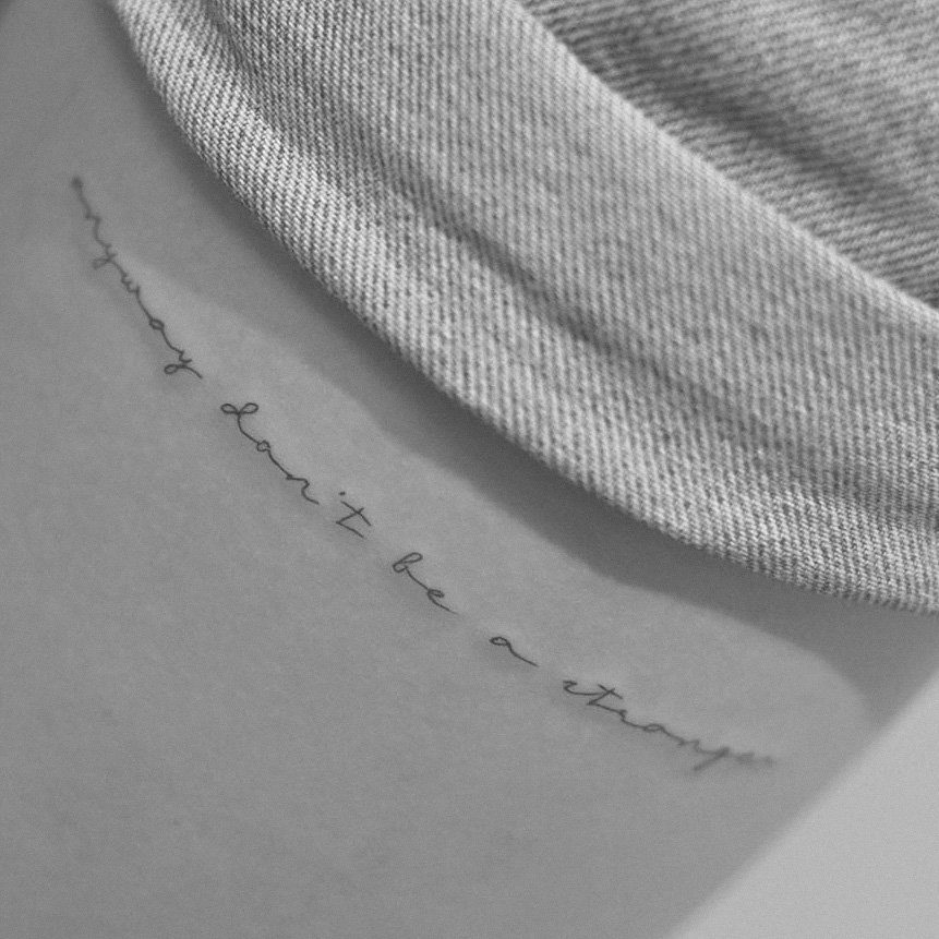
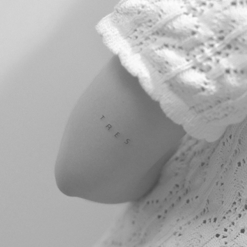
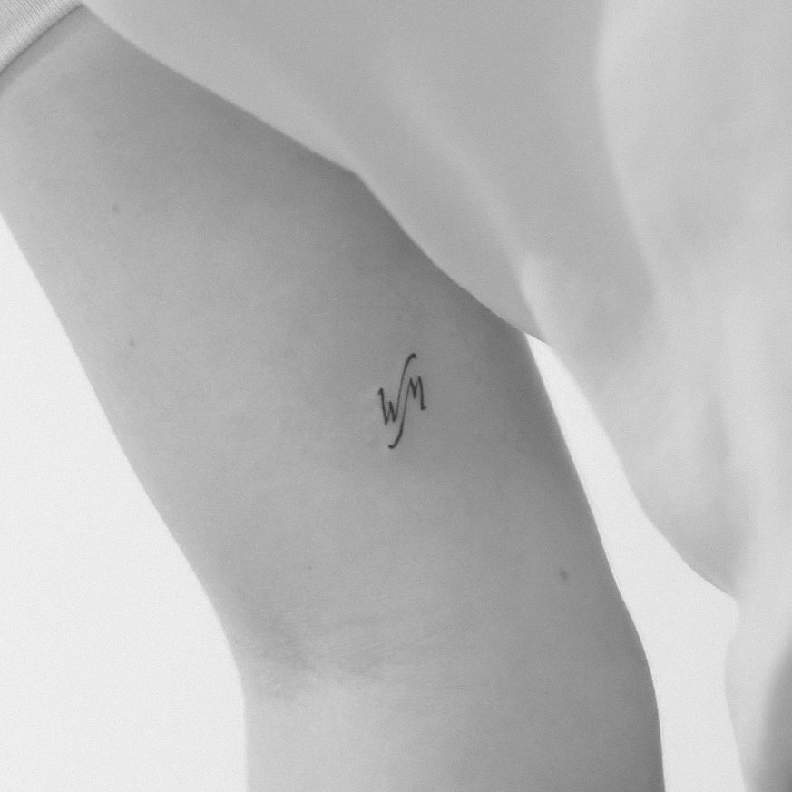
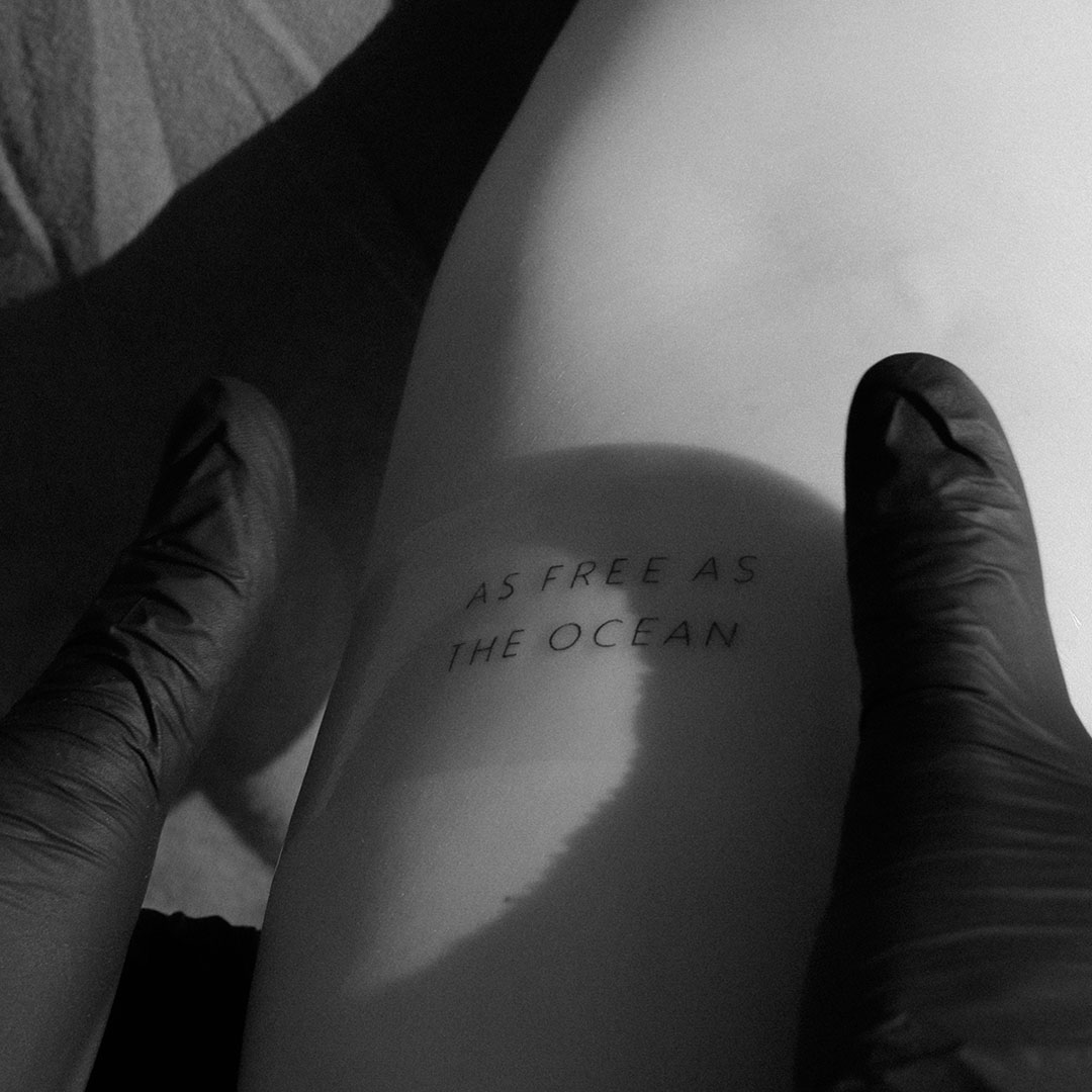
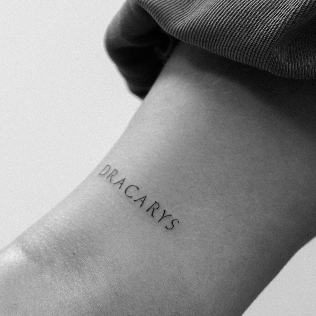
Hello Everyone! In today’s BLOG , I will write about the history of fonts. For all those who love LETTERING tattoos, books, or simply want to expand their knowledge, take five minutes in peace, and let’s go!
1. Blackletter (Gothic)
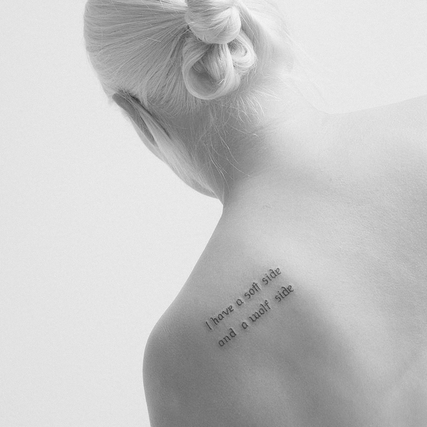
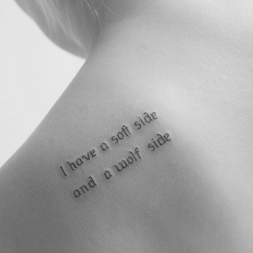
Originating in the 12th century, blackletter fonts are often associated with medieval manuscripts. This style, characterized by its ornate and angular forms, was prevalent in religious texts and official documents. You’ve likely seen examples of this font. Variants like Textura and Fraktur were widely used in Germany and the broader European context. In some places, like Tirol in Austria, many street names in smaller towns are still written in this font. It’s a surreal experience—it’s like stepping back 100 years into the past. Blackletter fonts evoke a sense of history and tradition, making them popular in modern designs that seek to capture a vintage or classical feel. Personally, I’ve also created a few tattoos using this font.
2. Roman Type
The invention of the printing press in the 15th century by Johannes Gutenberg marked a turning point in typography. Roman typefaces, inspired by classical Roman inscriptions, became the standard for printed materials. Fonts like Garamond and Caslon emerged during this period, characterized by their elegant serifs and balanced proportions. Roman type laid the foundation for modern typography, emphasizing legibility and aesthetic appeal.
Interestingly, the printing press was first invented in China. The earliest form of printing, known as woodblock printing, dates back to the Tang Dynasty (618–907 AD). This method involved carving an entire page of text onto a wooden block, which was then inked and pressed onto paper. The invention of the movable type printing press is attributed to Bi Sheng during the Song Dynasty (960–1279 AD). He created movable clay type, allowing for the reuse of individual characters and making the printing process more efficient.
3. Old Style
Developed in the 16th century, Old Style fonts represented a softer, more organic evolution of type design. These typefaces, such as Bembo, feature gentle curves and a warm, inviting appearance. The introduction of Old Style fonts coincided with the Renaissance, reflecting the era’s emphasis on art, culture, and humanism.
4. Transitional
The 18th century saw the emergence of Transitional fonts, which represented a shift from Old Style to modern typefaces. Characterized by increased contrast between thick and thin strokes, fonts like Baskerville introduced a sense of refinement and elegance. This period marked the beginning of a more systematic approach to typography, laying the groundwork for future developments in font design.
5. Didone
As typography evolved into the late 18th and early 19th centuries, Didone fonts emerged, characterized by high contrast and geometric forms. Bodoni is a prime example of this style, embodying the elegance and sophistication of the neoclassical movement. Didone fonts are often used in fashion and luxury branding due to their striking visual impact.
6. Sans Serif
While sans serif fonts gained popularity in the 19th century, their roots can be traced back even earlier. Early examples like Akzidenz-Grotesk paved the way for modern sans serif designs, which are now ubiquitous in contemporary branding and digital communication. The clean lines and minimalist aesthetic of sans serifs make them ideal for various applications, from websites to advertising.
Conclusion
As we continue to innovate and create in the world of design, understanding the origins of these fonts can deepen our appreciation for the craft of typography. We all use it every day, often without awareness. However, the choice of font can significantly impact the experience of reading a book, an ad, or a website, not to mention a tattoo! A poorly chosen font can diminish engagement. Whether you’re a designer, a tattoo artist like me, or simply a lover of beautiful letters, perhaps next time you read a book, you’ll take a moment to appreciate the art of fonts.
Thank You for Your Time!
Simon
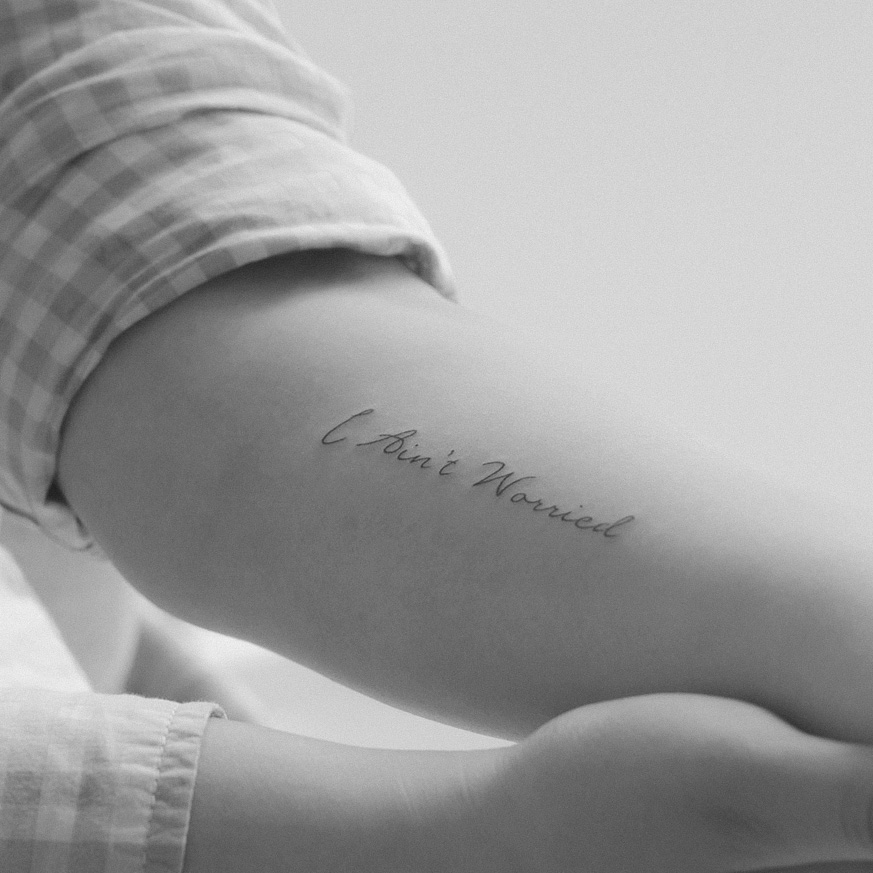
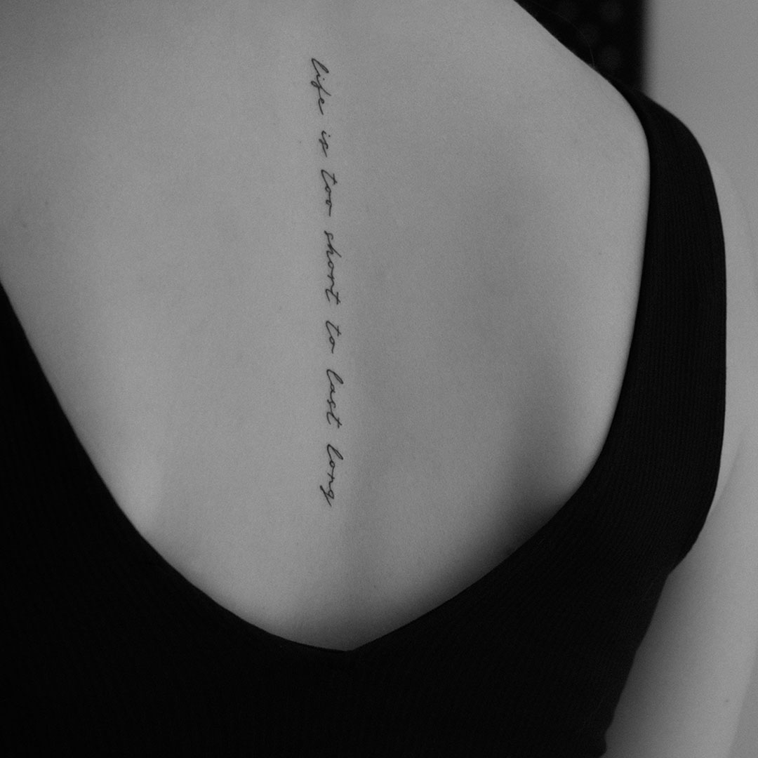
P.S. Do you like this font?
