The Art of Typography
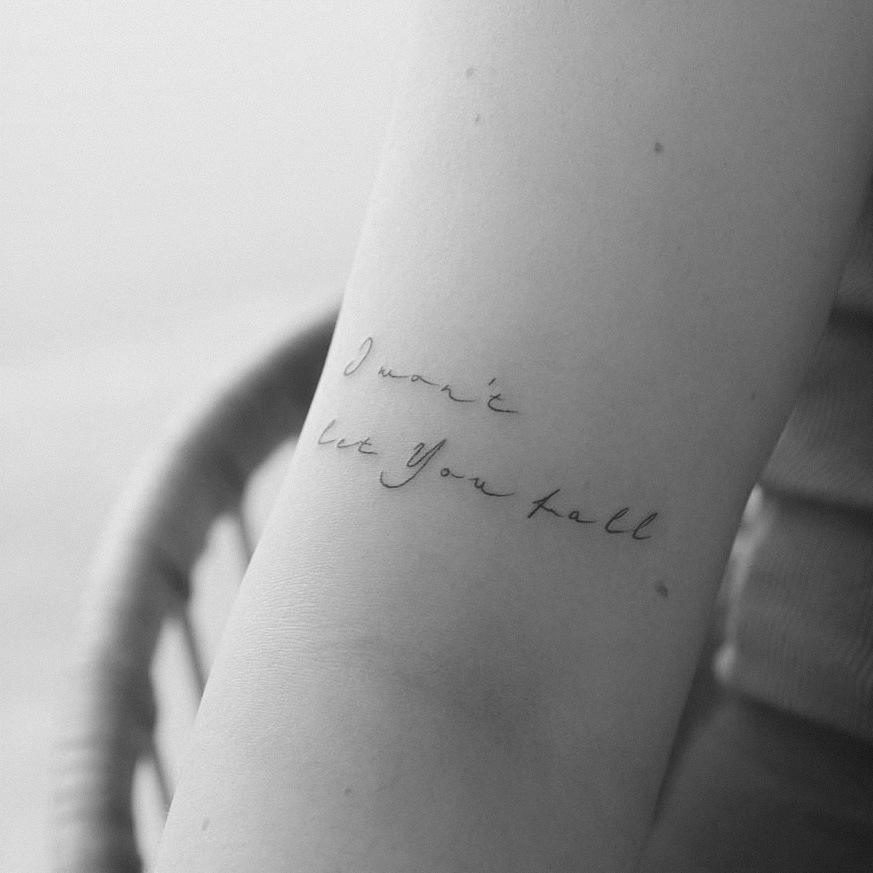
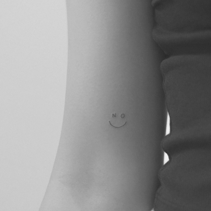
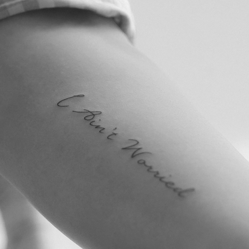
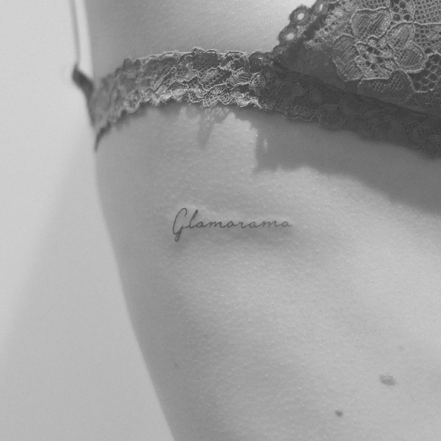
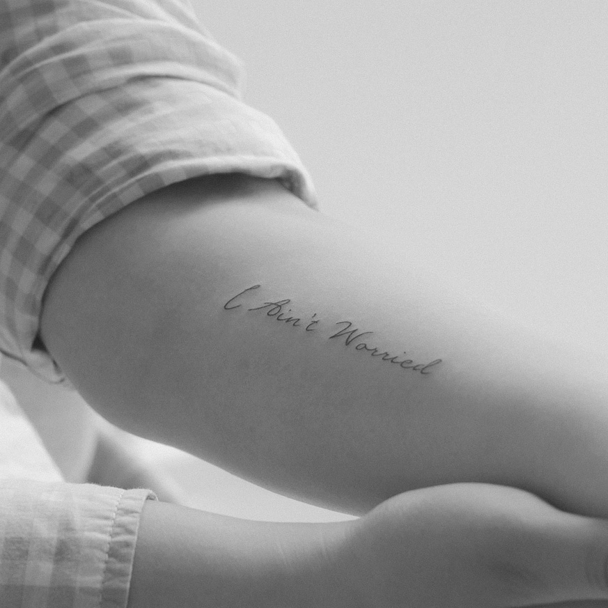
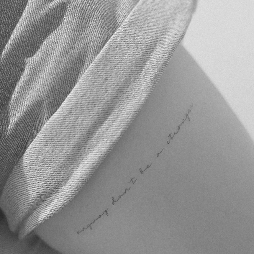
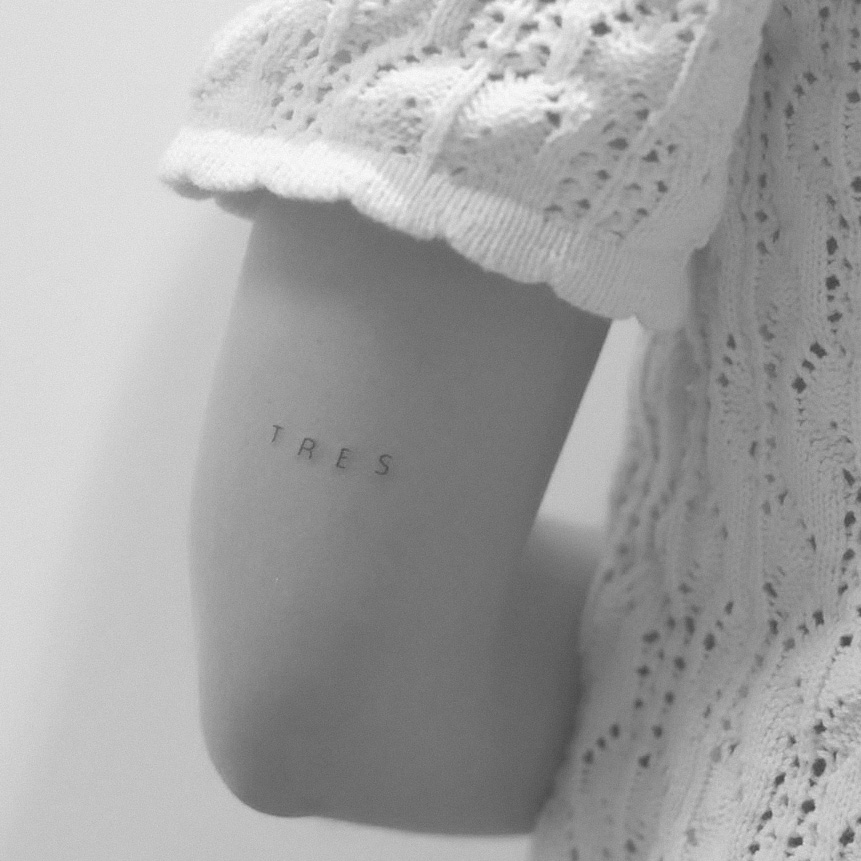
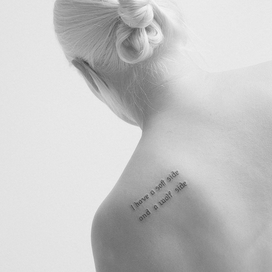
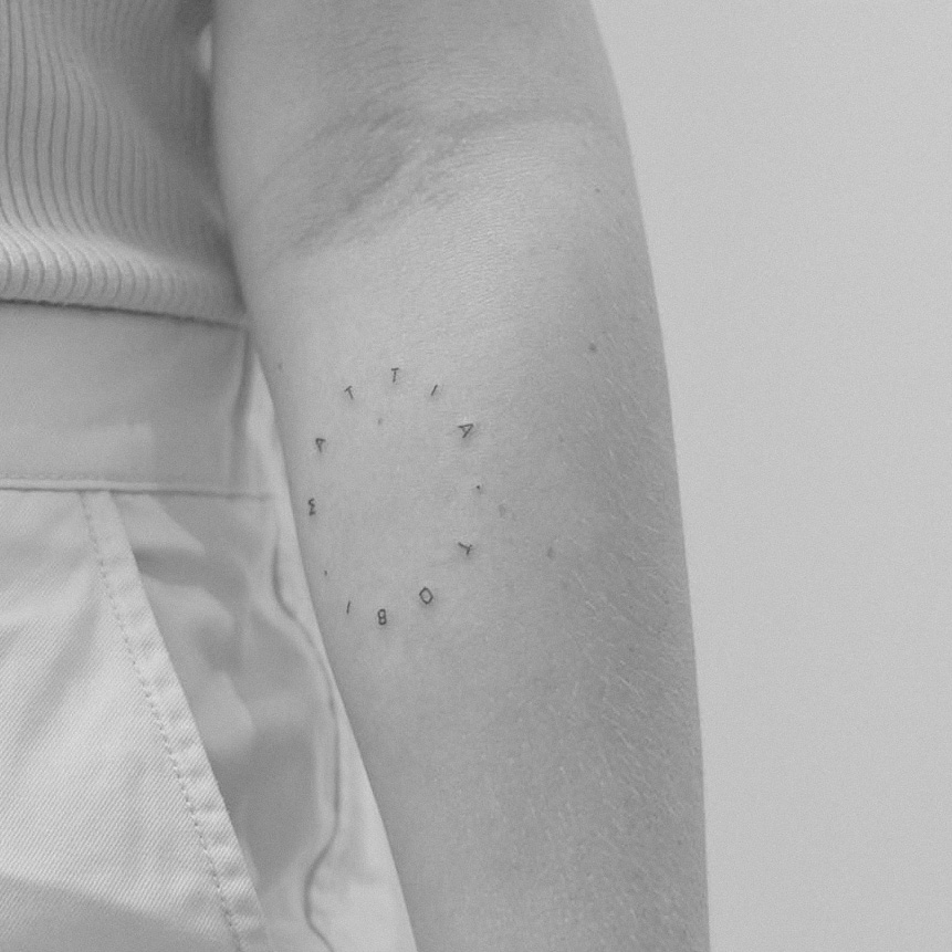
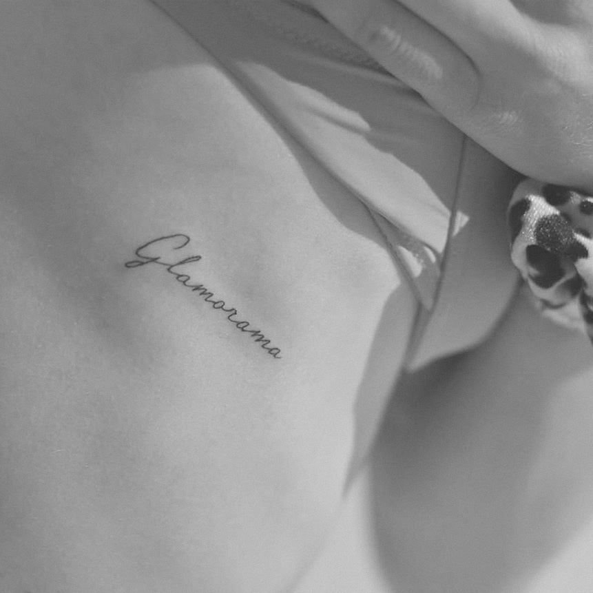
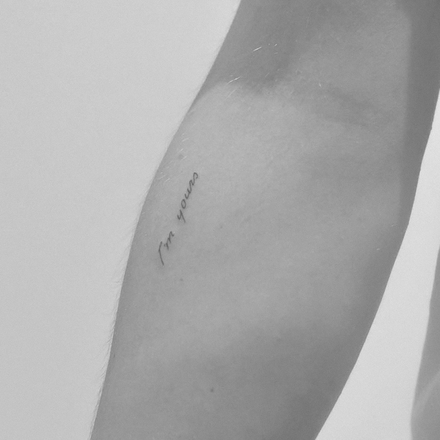
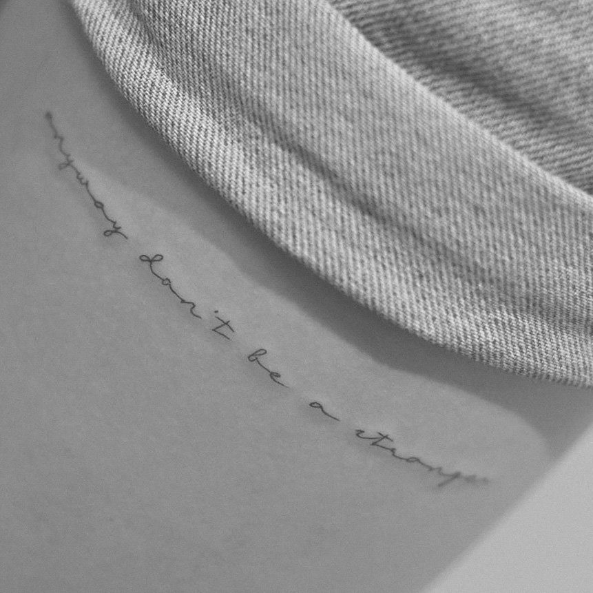
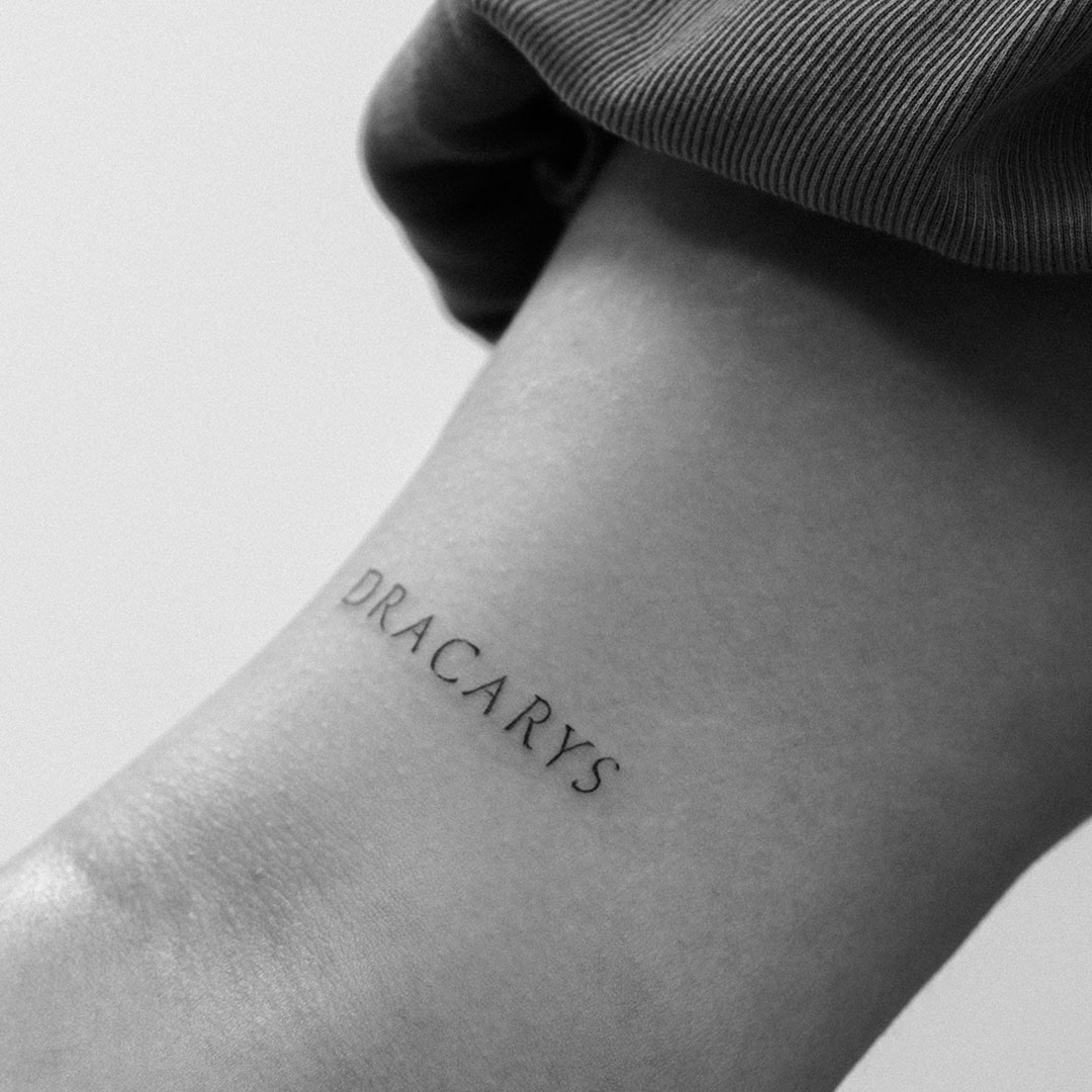
Hello Everyone! Today, I want to discuss a topic closely related to my specialization in tattooing: typography. Whether you’re designing a logo, creating a lettering tattoo, or just want to understand the beauty behind the letters, typography plays a crucial role. Let’s explore what typography is, why it matters, some key elements to consider, and a bit of its fascinating history.
What is Typography?
At its core, typography is the art and technique of arranging type to make written language legible, readable, and visually appealing. It’s more than just picking a font; it’s about how text is displayed to convey a message effectively. Typography involves everything from font choice and size to spacing and alignment.
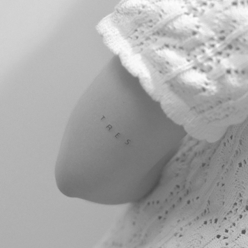
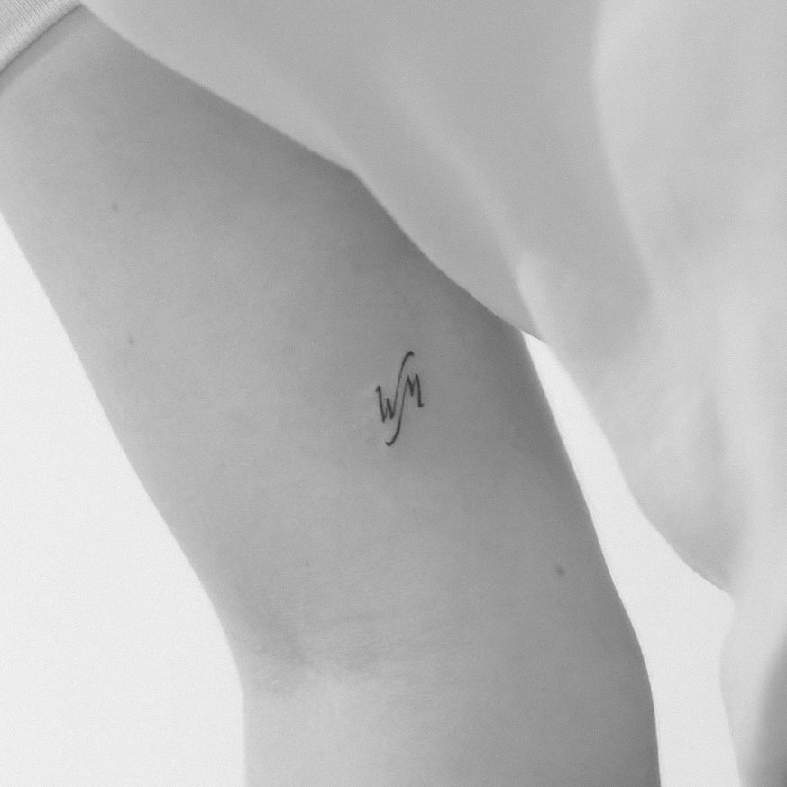
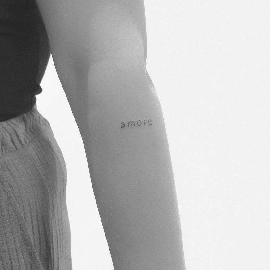
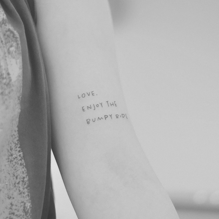
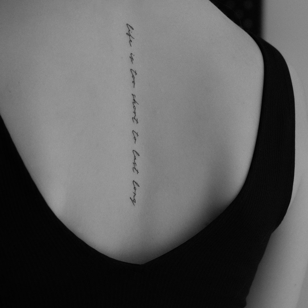
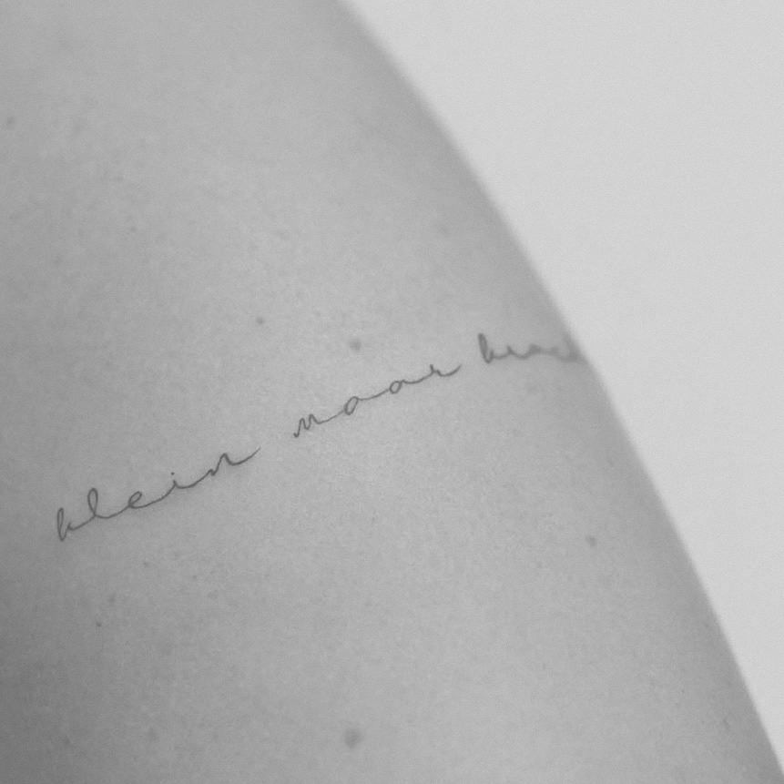
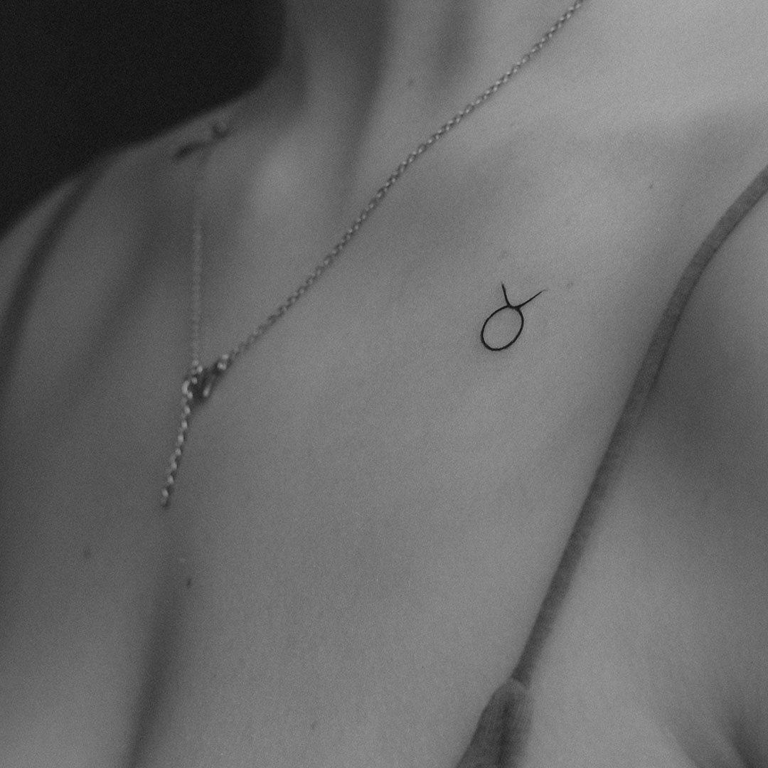
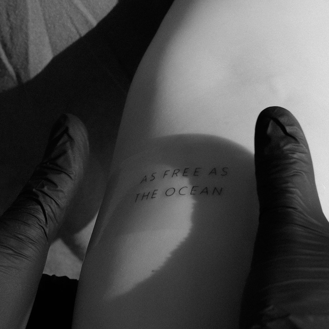
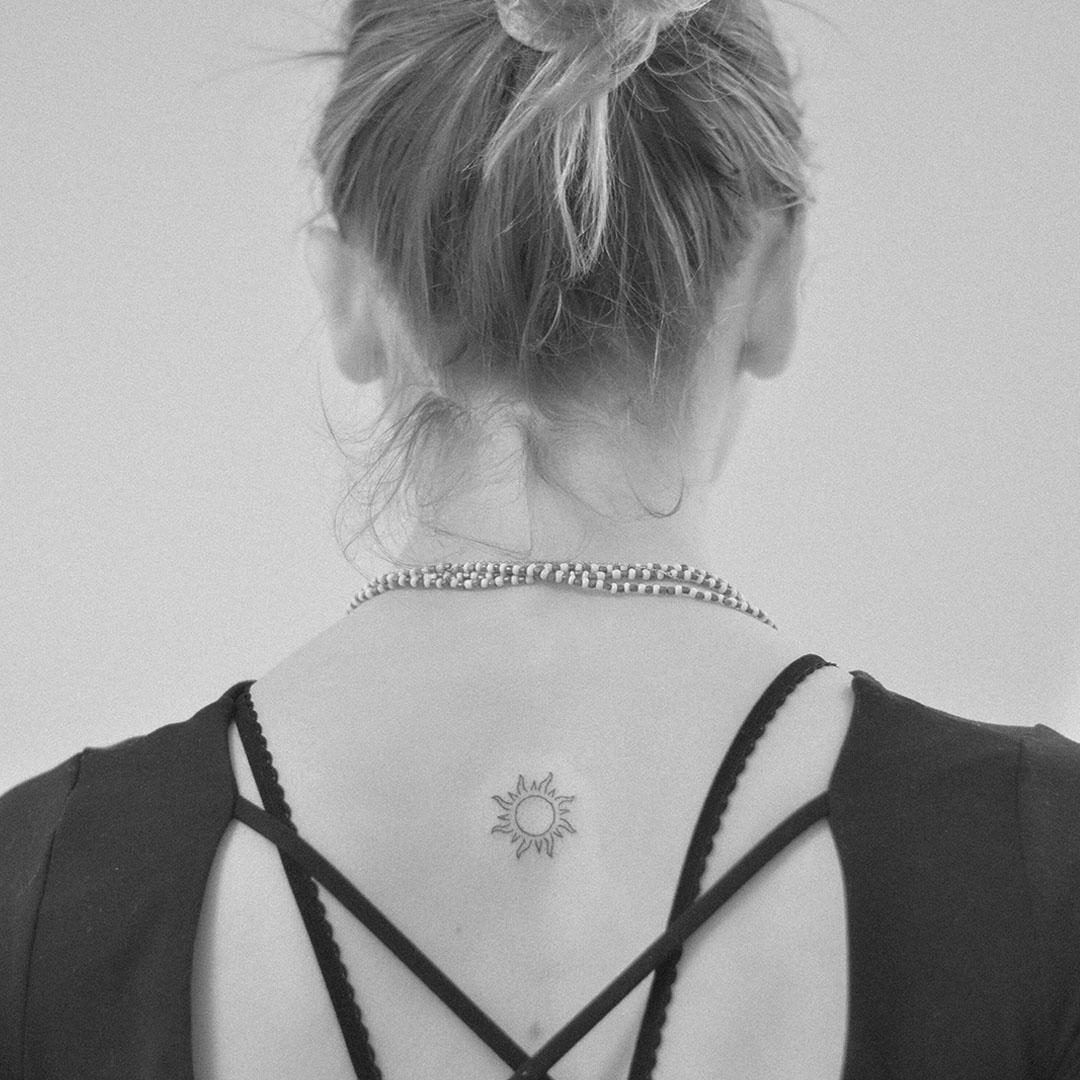
With tattoos, it is even more complex since placement on the body and the skin’s characteristics must be taken into account. A professional emphasis on these factors will define your satisfaction with your tattoo. With tattoos, there is no space for: “Whatever.”
A Brief History of Typography
Typography has a rich history that dates back to the invention of the printing press in the 15th century by Johannes Gutenberg. This revolutionary technology allowed for the mass production of books and led to the development of various typefaces. Plus, this invention helped to spread knowledge and elevate the overall condition of humanity.
Early Typefaces
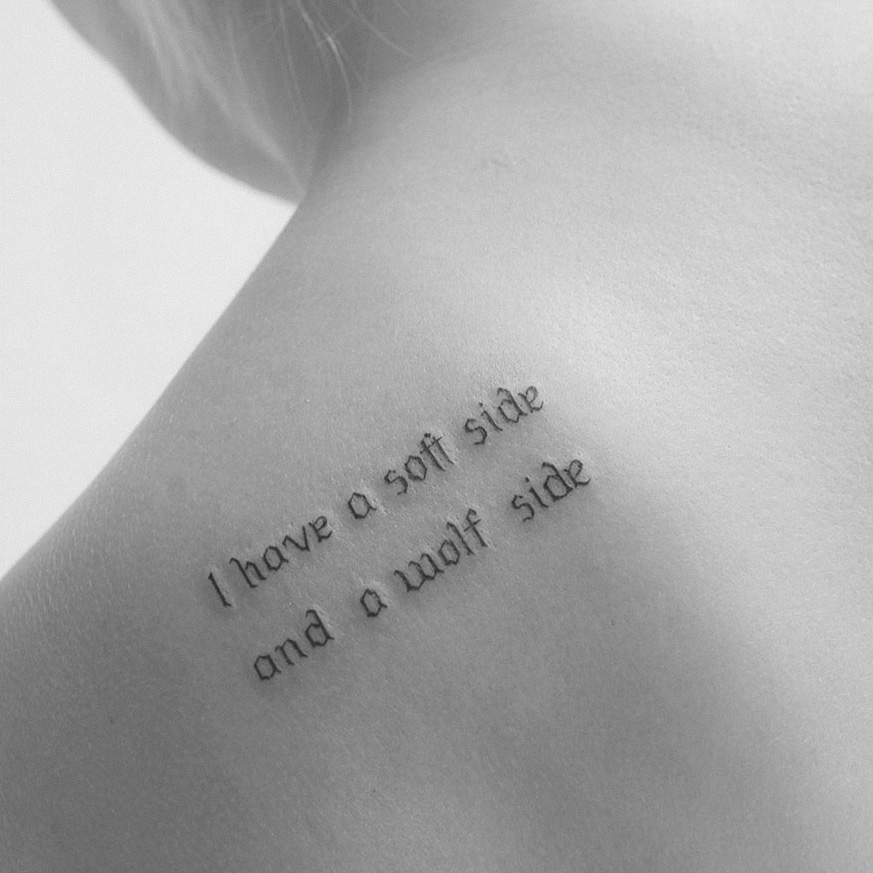
The first typefaces were designed to mimic the handwriting styles of the time, such as blackletter. Over the centuries, as printing technology advanced, new typefaces emerged, including serif and sans-serif fonts.
The Influence of the Bauhaus Movement
In the early 20th century, the Bauhaus school of design introduced a focus on functionality and simplicity in typography. This laid the groundwork for modern design principles.
Digital Revolution
The advent of digital design software in the late 20th century transformed typography, allowing designers to experiment with fonts and layouts in ways that were previously impossible.
Why Typography Matters
First Impressions Count
Typography sets the tone for your message. The right font can evoke emotions and influence how your audience perceives your content. A playful font can create a light-hearted feel, while a bold serif can convey authority. Not to mention the font called “Fraktur,” which still brings the same impression as 80 years ago.
Readability is Key
Good typography ensures that your text is easy to read. Poorly chosen fonts or inadequate spacing can lead to confusion or frustration for the reader. Prioritizing clarity enhances the overall experience of your content—super important with tattoos!
Visual Hierarchy
Establishing a hierarchy helps guide the reader’s eye through your text. By varying font sizes, weights, and styles, you can emphasize key points and create a more engaging layout.
Brand Identity
Typography is a vital component of your brand identity. Consistent font choices across all materials help create a cohesive look that reinforces your brand’s message and values. What brand came first to your mind?
The Influence of Steve Jobs
Steve Jobs, co-founder of Apple, was known for his obsession with design and typography. He believed that typography could profoundly impact the user experience. In fact, during his time at Reed College, he took a calligraphy class that later influenced the design of the first Macintosh computer. Jobs insisted on beautiful typefaces and excellent spacing, which played a significant role in making Apple products aesthetically appealing and user-friendly.
Key Elements of Typography
- Font Families: Fonts are categorized into families, such as serif, sans-serif, script, and display. Each has its unique characteristics and suitable applications. Understanding these can help you choose the right one for your project.
- Kerning and Tracking: Kerning refers to the space between individual letters, while tracking is the overall spacing between groups of letters. Proper adjustments in kerning and tracking can significantly improve readability.
- Leading: This is the vertical space between lines of text. Adequate leading helps prevent text from feeling cramped and enhances overall readability.
- Alignment: Text can be aligned left, right, centered, or justified. Each alignment style creates a different visual effect and can influence how your message is received.
- Contrast: Using contrasting fonts can create visual interest. Pairing a bold font with a lighter one can highlight important information and keep the design dynamic.
Tips for Effective Typography
- Know Your Audience: Consider who will be reading your text and choose fonts that resonate with them.
- Limit Font Choices: Using too many different fonts can make your design feel chaotic. Stick to two or three complementary fonts for a cohesive look. At Vadelma, we have only a few fonts to choose from: Available Projects.
- Test Readability: Always review your typography in different sizes and formats to ensure it remains readable across all platforms.
- Stay Consistent: Use consistent typography across your projects to build a recognizable identity. Good tip for marketing purposes! 🙂
Final Thoughts
Typography is an essential aspect of design that can transform your communication. By understanding the principles of typography, you can enhance the impact of your messages and create visually appealing content. Whether you’re a seasoned designer or just starting out, paying attention to typography will elevate your work.
Thanks for joining me in exploring the fascinating world of typography! If you have any questions or want to discuss more about this topic, feel free to reach out.
Thank You for Your Time!
Simon
“Tattoos that matter for people who care.”
